
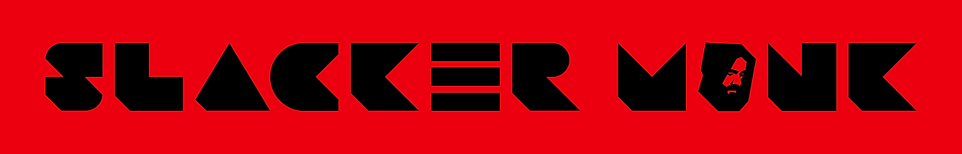
SLACKER MONK
Logo design for a new Electronic Dance Music artist looking to launch his music and brand.
Client: Slacker Monk
Industry: Music
Year: 2023
Software: Adobe Illustrator
Team: Solo
Time Frame: 1 Month
Creative Brief:
The client's vision for Slacker Monk centered around two primary objectives. Firstly, they aimed to cultivate a dedicated audience, and secondly, to transition their music into live performance settings. In crafting the logo, the client emphasized a preference for a design featuring black and white, with the possibility of incorporating one additional color. They expressed an affinity towards primary colors such as deep reds, bright greens, or intense blues.
The logo's intended platforms include Spotify, Bandcamp, and SoundCloud artist pages, thus necessitating scalability for optimal online and offline visibility, including merchandise. The client specifically requested a design with both an image and a wordmark component that could be separated if needed. Geometric shapes were favored, aligning with the client's appreciation for modern aesthetics.
Lastly, the client leaned towards a European-style theme, drawing inspiration from the imagery of a friar or "monk." This thematic element infused the design process with a unique cultural flair.


Research:
In my exploration of EDM artist logos, I observed a prevalent dichotomy between bright and dark themes. The client sought to harmonize these contrasting elements in innovative ways. Additionally, I delved into imagery of European friar monks, noting distinctive features such as bald spots on the crown of their heads with a 'U' shaped hair ring or the wearing of hoods. Variations in facial hair were also evident among these figures. Drawing from the client's own appearance—he sports facial hair but is experiencing balding and shaved his head—I synthesized these observations to inform the logo design.
Furthermore, I conducted research on the equipment commonly used by EDM artists to glean insights and inspiration. This examination revealed a plethora of components such as sliders, square buttons, rectangular buttons, knobs, and EQ's found on performance controllers and samplers, providing valuable design cues.

Brainstorm and ideate:
As I embarked on the design process, I envisioned a hooded monk figure gazing downward to evoke a sense of mystique, mirroring the artist's introspective demeanor during creation and performance. I carefully crafted the monk's facial features and contours to resemble the artist while adhering to geometric shapes for the brandmark logo, ensuring a cohesive visual identity.
Incorporating secondary colors alongside black and white imbued the brandmark logo with added depth and versatility. For the wordmark, I embraced the client's preference for geometric letter shapes, while also leveraging the angles of the brandmark logo to achieve symmetry across all letterforms. Utilizing triangle shapes for the letter 'A' and incorporating the 'EQ' motif from a sampler device into the letter 'E' were deliberate choices aimed at enhancing visual coherence and reinforcing the brand's connection to the EDM scene.
I meticulously crafted multiple iterations of the logo, including a two-line stacked combination mark, a one-line combination mark, and a standalone brandmark, each designed to be used independently as per the client's specifications.


Review: After presenting the initial iteration to the client, it became apparent that the colors I had selected were brighter than their preferences. In response, I adjusted the shades of green, red, and blue to be deeper and darker, aligning more closely with the client's vision. They expressed great enthusiasm for the combination mark, appreciating its versatility and the ease with which it could be separated into the brandmark logo and wordmark.

Presenting the Final Designs:
When unveiling the final design, the client expressed profound satisfaction with the logo and its various versions tailored for the diverse music landscape, encompassing popular platforms such as Spotify, Soundcloud, and Bandcamp. The versatility of the logo extended seamlessly to merchandise and concert posters for Slacker Monk, ensuring a cohesive and impactful visual presence across all mediums.
To enhance the project's value, I went the extra mile by incorporating additional merch designs, further enriching the brand's identity and expanding its potential for engagement and revenue generation.


Final Thoughts:
Every intricate detail, from the monk likeness to the subtle inclusion of an 'EQ' motif and the carefully selected colors and geometric shapes, contributes to making this EDM logo truly distinctive. With just one minor adjustment required, primarily concerning the colors, the smoothness of the project journey was remarkable.
Witnessing the client's excitement as they prepared to launch their musical persona into the dynamic world of EDM was truly exhilarating. Their enthusiasm was infectious, and I shared in their anticipation and eagerness for this new venture.