


Project Overview
Category: Banking
My Role: Brand Strategy Team - Designer
Timeline: 1 Month
Team: Solo
1. Understanding the problem

Fifth Third Bank maintains various specialized teams, including marketing, design, design strategy, development, and UX/UI design. However, these teams often worked independently when selecting colors for digital ads, campaigns, websites, app development, and print projects. This resulted in inconsistencies, with one set of colors for the UX/UI team and another for the remaining design teams. Additionally, accessibility to color resources such as color codes, meanings, and usage guidelines was lacking across projects. Recognizing the need for coherence and expanded options, the 5/3 Brand Strategy team sought to diversify the color palette across the bank's seven verticals. Moreover, they aimed to implement a user-friendly system for identifying colors within the offices swiftly. To achieve a unified aesthetic, the Brand Strategy team also proposed updating tints and shades for each color. Importantly, Fifth Third Bank prioritized ADA compliance, necessitating a color chart to distinguish accessible colors from those that did not meet standards during the palette update process.
Problem Recap:
-
1 vertical for all types of banking
-
Hard to read and not easy to copy and paste color codes
-
Inconsistent naming conventions for primary, secondary, and tertiary color palettes
-
Incorporating tints and shades for enhanced flexibility
-
Lack of quick reference to ensure ADA accessibility compliance for color combinations
-
Absence of a centralized hub for accessing color expression information and assets
-
Limited availability of clear visual representations of the verticals in office spaces

Old Color Palette
My Role:
-
Broaden the color palette for each of the 7 new verticals.
-
Provide easily accessible color values for copying and pasting.
-
Establish consistent naming conventions across all verticals for all teams.
-
Incorporate at least 2 shades and 2 tints for each color.
-
Design an ADA Color Accessibility grid for all verticals and integrate it into the central hub.
-
Upload all color expression assets to the designated centralized hub.
-
Develop engaging and visually appealing representations of the verticals' color palettes for display as posters in office spaces.
Problematic Color Palette
The old color palette presents several issues: firstly, it fails to cater to the specific needs of the Consumer, Commercial, Preferred, and Private Banking channels, as well as the Community and Employee channels. Additionally, it lacks metaphors associated with each color or indications of which verticals these colors are suitable for. Furthermore, there is a absence of tints and shades for each color, and the layout makes it challenging to copy and paste into projects.

2. Doing the research
The Fifth Third Brand Strategy Team had developed seven distinct verticals, each tailored to address specific audiences within the organization just before I started with the team. Within these verticals, the bank utilized general naming conventions for colors, as outlined below.

The design strategy team intended to establish a unified source for the design system through Zeroheight.

The team also used Sketch to create and transfer finalized project assets into Zeroheight. Additionally, 5/3 Bank utilized Abstract as a project version control tool during the expansion of the color palettes. I felt comfortable using Sketch and was eager to learn how to use Abstract.

Sketch
Abstract
I discovered an excellent website for generating a color grid to assess which colors meet or fail ADA Accessibility standards. Contrast Grid provided the most user-friendly grid layout for quickly identifying pass / fail combinations.

The naming conventions pose a challenge because of their generality, making it easy for them to be confused or mistaken for other similar colors used in projects. I believe this presents an excellent opportunity to continue on the unique naming conventions used for a few colors from the old vertical. This was an ideal choice as minerals and stones offer a vast spectrum of colors and boast highly distinctive and unique names.

Finally, recognizing my limited experience in writing HTML code for websites, I understood the importance of providing designers and developers with color codes in an easily accessible copy-and-paste format. Here's an example of how it appears.


3. Ideation
Naming Conventions
Task number 1 was to change the naming conventions to match mineral colors to the colors that were chosen for each of the 7 verticals. This was a tedious process that took quite a bit of time. Here is what I came up with.
Dark Teal
Medium Teal
Light Teal
Green
Yellow
Gold
Dark Blue
Purple
Pink
Red
Orange
Mustard

Medium Blue
Blue
Light Blue
Aqua
White
Light Gray
Black
Charcoal
UX Black
Dark Gray
Warm Gray
Cool Gray
Silver
Previous Conventions
Adding, changing and removing colors
As Fifth Third Bank was expanding its brand verticals this was an opportunity to do the same with the colors within each vertical. Diving deep into color theory I saw opportunities to connect colors and change colors to work together by finding more colors using variation. Variations of these colors included shades, tints, and complementary colors. Here is a color table broken down by vertical.
Changing colors (Outlined in Pink)
-
Onyx, Platinum, Moonstone, Limestone, Pearl, Coal, and Obsidian represent different shades within the spectrum of Coal, or in this context, the absence of color.
-
Citrine is a lighter iteration of the previous yellow, tailored to better suit the Preferred and Private verticals.
-
Jasper embodies a more intense variation of the old orange.
-
Amethyst offers a brighter alternative to the previous purple used in the vertical.

Adding colors (Outlined in Green)
-
In the consumer, employee, and community verticals, I introduced Rose and Fire Opal. Rose brings a playful tertiary hue, while the team sought a vibrant red like Fire Opal to convey urgency in social campaigns and UX/UI designs for data visualization.
-
For the preferred vertical, I incorporated Apatite a darker shade of Jade, Jade, and Zircon, and a lighter shade of Jade, alongside Tiger Eye for its harmonious compatibility with both Apatite, Jade, and Zircon.
-
In the private banking vertical, I included Bloodstone and Dumortierite, two analogous colors that complement each other seamlessly.
-
In the UX vertical, Amber and Lt Fire Opal were introduced specifically for enhancing UX/UI designs in data visualization contexts.

Removing colors
-
I omitted the colors Fluorite, Peridot, Turquoise, and Ruby from the previous vertical as they did not align with the new direction the brand was taking.


Expanding the spectrum
Fifth Third Bank requested the incorporation of tints and shades to broaden the spectrum of color expression within the design system. In my research for selecting appropriate variations, I opted to utilize 300 and 100 on the tint spectrum and 700 and 900 on the shades spectrum for each color. I selected these values for their distinct differentiation from the original color.

Passing ADA standards and being compliant
The Americans with Disabilities Act (ADA) prohibits discrimination against individuals with disabilities in various domains, including employment, transportation, public accommodations, communications, and access to state and local government programs and services. Therefore, any changes to branding or design systems require careful attention to ensure compliance with the law. As I developed the color palettes for each vertical, I meticulously assessed all colors using the contrast grid to determine their suitability for campaigns, advertisements, websites, and app designs. Here are a few examples showcasing the color palettes undergoing testing in the contrast grid. These grids are now integrated into the design system in Zeroheight for each vertical.


Office Colorful Artifacts
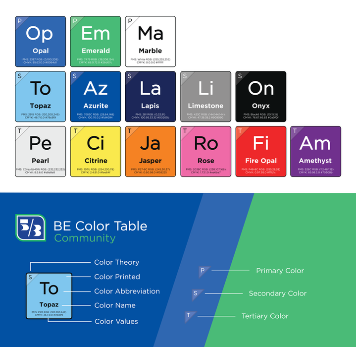
Fifth Third Bank aimed to spotlight elements of the new color expression for each vertical, providing designers, engineers, product managers, and marketing teams with easy-to-access reference materials to ignite excitement for the launch of the new design system on 5/3 day. I believed that integrating the science and chemistry of minerals and the periodic table would offer a fun and visually organized approach. Each tile showcases the printed color, abbreviation, PMS color value, CMYK color value, hexcode value, and designation within the palette. Here is an example of one of the verticals presented as a poster.
Single Source, Zeroheight it is!
Finally, centralizing all these color expression assets into one accessible source for all teams was a logical step. Zeroheight acts as a centralized hub, promoting collaboration and boosting organizational efficiency across designers, engineers, product, and marketing teams. Consequently, we consolidated all color expression assets and integrated them into Fifth Third Bank's Zeroheight account. Below is the Universal Palette's page, featuring HEX, RGB, PMS, and CMYK values, along with the enhanced value of associated metaphors and the target audience for each color's usage.


4. Review
Colors: Chop and Change
When the Brand Strategy team and I conducted a review of the selected colors, we placed particular emphasis on the shades of gray and black. Additionally, we sought input from the head of UX/UI design to ensure comprehensive consideration. The team had several objectives regarding the grays and blacks. Firstly, they aimed for a true black for optimal printing results. Furthermore, they desired shades of blacks and grays that would function effectively in dark mode on both desktop and mobile platforms. The team also prioritized the availability of cool, warm, and core dark gray tones. Lastly, they aimed for seamless integration of these colors across brand, marketing, and product teams, as well as within the engineering and UX/UI design teams.
Gray Family
The team and I landed on aligning all the versions of gray based on the Pearl gray color. Initially Limestone, Moonstone, and Platinum were not in the same shade or tint family of the Pearl color.

Black is black is black, or maybe not?
Our brand strategy team leadership expressed a desire for a black shade that was both soothing and high-contrast, yet not overly sharp or harsh. In researching the optimal black for printing, many internet articles emphasized the use of C0, M0, Y0, K100, but we found this black to be too harsh visually when viewed digitally. Consequently, I conducted further research and discovered that Fifth Third black, named Onyx, proved to be a more suitable option. After testing, we determined that a CMYK combination of C76, M67, Y66, K83 met our criteria and left our leadership very pleased. This black demonstrates exceptional performance both on screens and in print.

New UX/UI Colors
During discussions with the brand strategy leadership team and the UX/UI design lead, we identified a need to expand the color palette to better accommodate data visualization in both light and dark modes for the app and website. To address this, I introduced a selection of colors from other verticals that would fulfill this requirement, along with a few additional colors specifically for UX/UI purposes. The new color additions are outlined in red below.


Tints and Shades
After the initial review with the team regarding the tint and shade levels, it was determined that the 700 and 900 shade levels were too dark, while the 350 tint level was too similar to the palette color. In response, I identified a suitable compromise by opting for 200 and 100 on the tint spectrum, and 650 and 800 on the shades spectrum for each color.

Contrast Grid
The information provided by the contrast grid was too much input for the design system page on its own so I thought adding specifics for each vertical would provide more clearly defined do's and don'ts as shown below.

Universal Color Spectrum Guide
Recognizing that each vertical possessed its unique spectrum of colors, spanning from reserved to expressive, primary to tertiary, the team prioritized establishing a clear framework for the universal color palette to guide designers effectively. To this end, I developed a comprehensive guide, enriched with examples of colors, shapes, patterns, icons, and mock-ups, facilitating seamless integration and cohesion across the various design elements.

Across the entire 5/3 brand system, layouts have the flexibility to span from reserved to expressive, with the specific vertical and target audience influencing this spectrum, along with the intended application. Each section of the document is dedicated to elaborating on the guidance for every quadrant of this spectrum.
It's important to note that this spectrum serves as a guiding principle rather than a strict rule, allowing for interpretation and adaptation. Within each vertical cluster, representation is achieved through the careful consideration of color, shape, and composition.
Brand Expression Posters
No changes were requested for the brand expression poster design; instead, the only request made was to create individual posters for each vertical, as well as a single poster incorporating all the verticals.

5. Final Results
Whats in a name?
The Fifth Third Brand Strategy, marketing, product, and engineering teams were enthusiastic about maintaining the naming convention inspired by minerals and stones. This thematic approach added depth and coherence to our branding efforts, fostering a sense of unity and identity across various departments.

New colors, tints, and shades
create new possibilities?
The marketing, brand, and UX/UI teams were particularly enthusiastic about the prospect of incorporating the fresh array of colors and combinations from the new verticals into their designs tailored for specific banking audiences. This opportunity presented a chance to enhance the brand's resonance within various banking sectors by offering a more diverse and targeted color palette. Consequently, the addition of these colors facilitates a more refined and focused approach to branding across different banking channels within the organization. Below you will see inspiration boards created with the new color palettes.


Designing for everyone
Designing with accessibility in mind is paramount. Ensuring equal access for all individuals is a fundamental principle that guides our design process. By adhering to ADA Compliance Accessibility standards, we not only meet legal requirements but also guarantee that everyone, regardless of their abilities, can enjoy a seamless experience when accessing content or interacting with the banking website and app. This commitment to accessibility reflects our dedication to inclusivity and user-centric design practices.

Visualize the design
Crafting a visually captivating and informative poster destined for display in the corporate offices of Fifth Third Bank's marketing, product, brand, and engineering teams was undeniably one of the most exhilarating endeavors I embarked upon during this contract. Immersed in the creative process, I found immense joy and satisfaction in bringing our vision to life. Witnessing the culmination of our efforts in the final product was truly rewarding. The poster seamlessly aligns with our core objectives and stands as a valuable resource for our teams. The anticipation of unveiling it on 5.3 day only added to the excitement shared by the entire team.


Wrapping up the project
Fifth Third Bank, its brand strategy team, and the other teams have an outstanding foundation for success no matter the project. This project took me all of 2 months to complete from start to finish. What I learned from my time working in color theory and color expression for a well-known Midwest and East Coast bank was invaluable on so many levels. I learned about ADA compliance, the different levels of passability with color combinations, how to source colors to build versatile color palette verticals, what tints and shades worked for this organization and their teams, the value of naming conventions, and the time it takes to connect a color with a mineral. I became more comfortable working in Sketch, Abstract, and Zeroheight. I also gained experience working with multiple teams to achieve many goals within one brand focus.
Here is what one of the three team leaders said "I wanted to take a moment to express my sincere gratitude for your invaluable contributions to our brand guidelines and system. As Catherine and Gem have mentioned, your work will have a lasting impact for years to come. We appreciate the attention to detail and effort you put into building out our color palettes, shape library, PowerPoint infographics, and logo files.
We were impressed with the quality of work you produced within such a tight timeframe, and we feel grateful to have had the opportunity to work with you. Your work has truly helped us to achieve our goals, and we wish you the best in your future endeavors. Stay in touch!"